PART 6/ PART 7/ PART 8/ PART 9/
PART 10/ PART 11.
We are surrounded by technology of a kind that our great-grandparents could barely have conceived of. And now it’s threatening to change all our lives in ways we still don’t understand.
No one asks why the once-smooth path of human technological progress shot skyward shortly after World War II. No one seriously asks how this happened; to do so is practically blasphemous, heresy.
Bell Laboratories– a division of American Telephone and Telegraph– was at the center of it all, unleashing one world-changing technology after another. Perhaps it’s worth taking a look at the strange symbolism they often used, particularly during their ill-fated 90s makeover as Lucent Technologies.
Because it might answer some questions about the origins of our current Technocratic dystopia…
eventually become part of Lucent
..
This series was not supposed to be a series. It was originally supposed to be a two or three part post on the Lucifer TV show in the context of the technocratic dictatorship that is currently unfolding around us.
But new evidence and connections kept throwing themselves at me, seemingly out of nowhere, growing what were sections, or even paragraphs, into entirely new posts. Some of the evidence was incredibly strange, almost seeming to step outside of space and time. Some of it remains in the folders, waiting for me to make sense of it at a later time.
Then there’s this.
THE RING
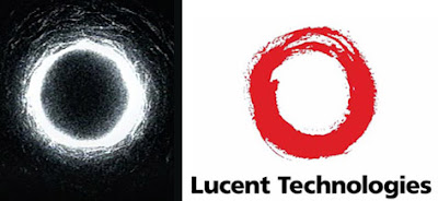
Bell Laboratories’ name change to Lucent Technologies in 1996 was controversial, within and without the company. Even more so was the logo, which was called everything from the “big red donut” to the “flaming a**hole.”
Many noted its resemblance to an Ouroboros, feeding the flames of conspiracy theorizing. But something kept nagging at me, another connection that I just couldn’t shake.
The idea of the “well” kept bothering me as I was working on this series. I couldn’t shake the association of Lucent with Roswell (which, again, I don’t believe was a flying saucer crash event but something more ritualistic and complex) but I knew there was something else, something I wasn’t getting at.
In the film, a videotape circulates with bizarre, disturbing imagery, including a cryptic ring. As it turns out the ring is actually an image of light emerging from under a well-top.
What color is the Lucent logo again? Red?
Red like a what…? Plus, the well, and….oh.
ONE PROBLEM
But there’s only one problem; that image came from a 2002 movie, at least six years after the Lucent logo was designed.
Well, as it turns out, however, the original novel for The Ring was published in Japan in 1991 and was made as a Japanese TV movie in 1995, right around the same time Lucent was developing its new logo. Hey, how about that coincidence?
The plot of the original TV movie was much different than The Ring but also had to do with a well. In fact the well was featured more prominently in the original movie than in Ringu or The Ring.
Thanks to the miracle of back-engineered alien technology the Internet, I was able to check out the 1995 movie for myself. And found this:
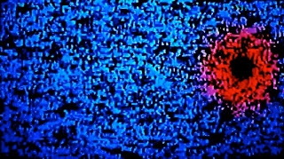
A messy “red donut.” Jeez, how about that ‘coincidence’? The red ring moves quickly but is the predominant image in the cursed video in the TV movie.
I ran the capture through a contrast filter and got this image, which was an intermediate step to…
.
…this.
Black + red with white accents was actually the predominating color story for Lucent. I knew that since we got a lot of Lucent swag over the years.
Now what about that distinctive silhouette with the cutaway in the top center from Lucent logo?
.
OK, but what about the distinctive “brushstroke” look of the Lucent logo? Well, believe it or not, that can be traced back The Ring as well…
.
…in the design of the 1995 VHS release of the TV movie.
Did I mention the logo was named, for some bizarre reason, “The Innovation Ring?”
Did I mention that The Ring is a movie about a well?
.
What’s even stranger is that Ring sequels and remakes would use logos remarkable similar to the Lucent logo as well (particularly the one on the left).
What kind of bizarre, asynchronous feedback loop was at work here?
Now, this is crazy, right? A company like Bell Labs– or rather the design firm they hired– would never use some Japanese horror movie as inspiration for their corporate logo, right?
It’s not like Bell Labs named a major operating system after an Ed Wood flying saucer movie.
Or something.
Well, OK, OK, but that’s a well-known cult classic. How would they know about a Japanese TV movie?
I mean, the branding firm who came up with the logo was/is located in San Francisco.
I mean, it’s not like they’ve had an office in …Tokyo …since the ’50s…
.
THE DIRECTIVE
I always try in circumstances like this to imagine the directive, the assignment. What is this logo meant to convey?
Given their name-game and Inferno, were Lucent playing with the Circles of Hell motif?
Or did Bell Labs in fact originally want a logo that would symbolize a well?
The Ringu links suggest that may have been the case. I mean, “the well of innovation,” something like that, right? The ring could very easily be a stylized depiction of a welltop, which are traditionally round. Why not?
But it’s more complicated than that.
Wait, you say; kissing snakes?
.
Remembering the fate of Cadmus† (or ‘Lucent’, whatever you prefer) and Harmonia, it’s hard not to notice the Lucent logo may not in fact be referencing an Ouroboros but in fact a caduceus or in more accurately the seal of Gudea, which paid tribute to his patron god, Ningishzidda.
Who is that, you may ask?
He was both Lord of the Underworld –like Pluto– but also a bearer of knowledge and hidden wisdom, like Hermes.
He may in fact also be the prototype for Cadmus himself, since he, like so many figures associated with knowledge and wisdom, was also associated with serpents (Jesus: “Be ye wise as serpents,” Matt 10:16).
Ningishzidda is credited with providing Gudea — one of Sumer’s most enlightened and best-known rulers (22nd century B.C.E.) — a set of divine instructions, a “holy stylus”, in which the direction and orientation of a great temple could be established. The temple, itself, was a ziggurat, a seven stage pyramid…
Jesus, I can’t even say it out loud.
POSTSCRIPT: We seen the the connection of Roswell to Bell/Lucent and Roswell to Aleister Crowley’s Book of the Law. What should be noted is that Lucent was eventually bought out by French conglomerate Alcatel and became Alcatel-Lucent. Note the logo.
POSTSCRIPT: I know all about the ensō, and make mention of it in the text (the “Zen symbol”). I read quite a bit about it while researching this post. However, I think the references to it were after the fact, and were a response to criticism of the Ouroboros.
Remember that Lucent changed their story several times. This is a story about symbolic duplicity. There’s also no meaningful thematic connection with the ensō to Bell Labs or Lucent.
† It’s important to note here that Hermes himself was worshipped under the name ‘Cadmus’ at Samothrace, given us yet another connection to Ningishzidda.
